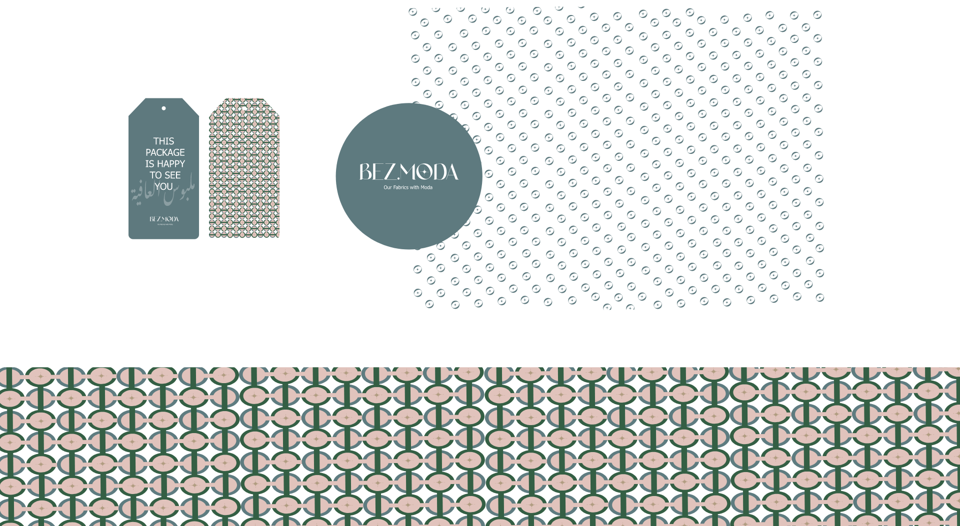
Bezmoda
We create an amazing logo and identity for a luxury fabric brand.

We create an amazing logo and identity for a luxury fabric brand.

The “Bezmoda” logo features a minimalistic and stylish design. The primary focus is on the star-shaped key symbol, which represents the key brand element. The key signifies access, unlocking possibilities, and being a vital component in the brand’s identity. It conveys a sense of reliability, trust, and exclusivity. The logo’s overall simplicity and clean lines reflect the brand’s modern and sophisticated image, making it visually appealing and memorable.
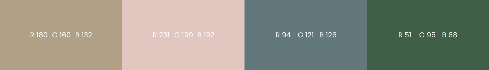
Beige represents neutrality, sophistication, and a timeless appeal, reflecting the brand’s quality and versatility. Pink adds a touch of femininity, softness, and playfulness, appealing to the brand’s target audience. Green symbolizes freshness, growth, and nature, conveying a sense of eco-friendliness and sustainability, which aligns with the brand’s values. Together, these colors evoke a sense of modernity, refinement, and a connection to the natural world, enhancing the overall brand experience.
LET”S COLLABORATE