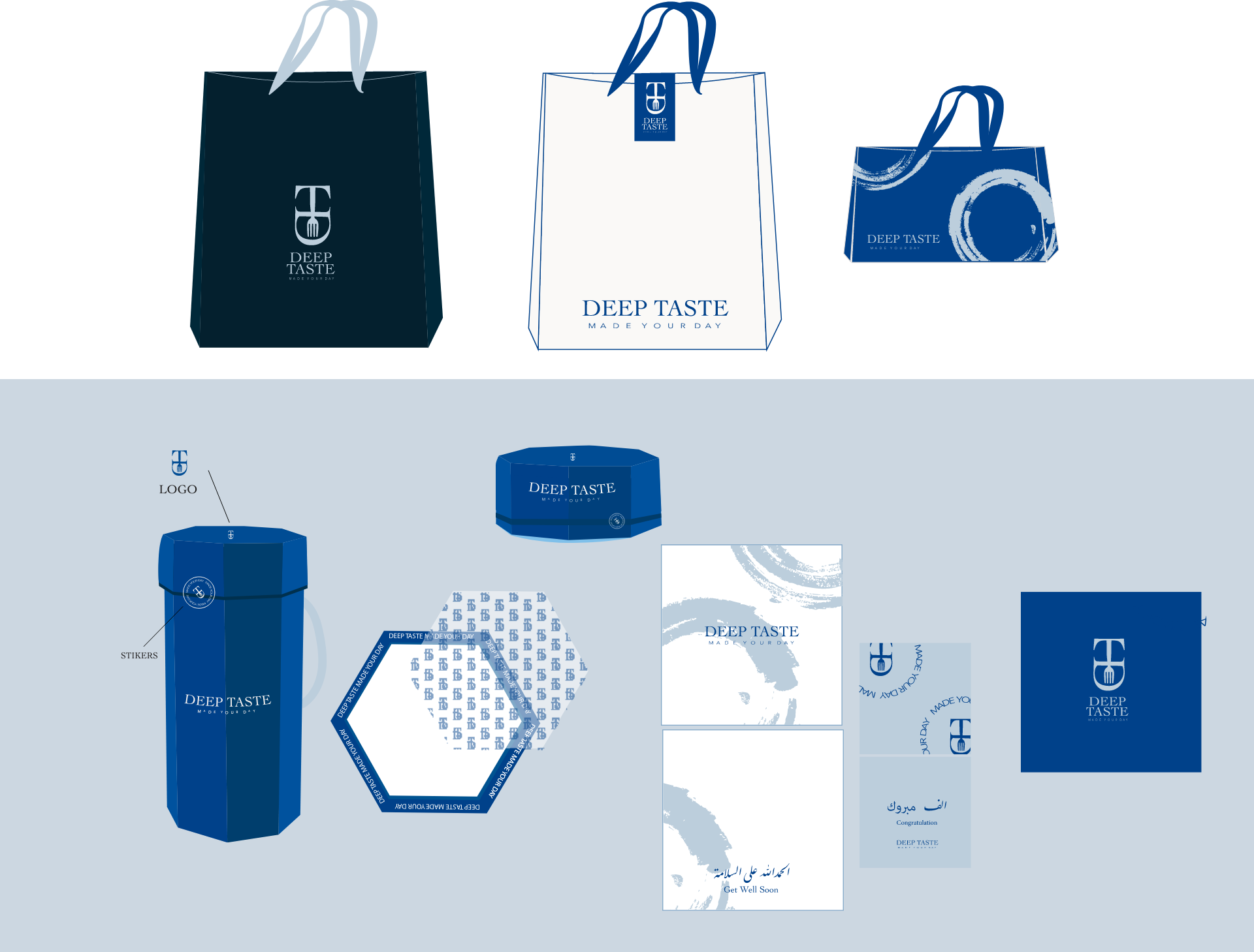
Deep Taste
Elegant restaurand brand with luxury design

Elegant restaurand brand with luxury design
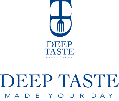
Combination mark of the letters “D” and “T.” The design is carefully crafted to create a unique and memorable mark that represents the brand’s focus on exquisite and flavorful cuisine. The letter “D” and “T” are elegantly intertwined, symbolizing the deep and rich flavors offered by the restaurant. The combination mark exudes sophistication and simplicity, capturing attention and evoking a sense of fine dining and culinary excellence. The “Deep Taste” logo’s combination mark represents the brand’s commitment to providing a unique and delightful dining experience, making it visually appealing and distinct in the restaurant industry.

Combination of pastel colors, including rich blue, navy, and cream, for the restaurant brand “Deep Taste” creates an elegant and refined visual identity. Rich blue represents depth, tranquility, and sophistication, reflecting the brand’s commitment to offering a unique and memorable dining experience. Navy adds a touch of elegance, formality, and a sense of mystery, enhancing the overall ambiance of the restaurant. Cream contributes to a sense of warmth, comfort, and luxury, creating a welcoming and inviting atmosphere. Together, these pastel colors create a harmonious blend that conveys a sense of culinary excellence, sophistication, and a memorable dining experience. The pastel color combination aligns perfectly with the “Deep Taste” brand’s focus on providing exquisite flavors and a refined dining environment, enhancing its visual appeal and setting it apart in the competitive restaurant industry.
LET”S COLLABORATE