Etel
We create an amazing logo and identity for a nail spa brand.

We create an amazing logo and identity for a nail spa brand.
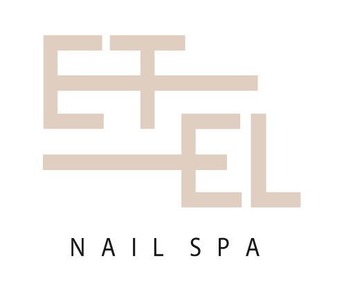
Design balances the squared shape, which adds a hint of playfulness and uniqueness, with an overall sense of refinement. The combination of these elements creates an interesting contrast that captures attention and evokes curiosity. Despite the squared and clumsy design, the logo maintains an elegant look, reflecting the brand’s commitment to providing high-quality nail services in a relaxed and welcoming atmosphere. The logo’s design communicates a sense of approachability and professionalism, appealing to a diverse range of clients seeking a sophisticated and enjoyable nail spa experience.
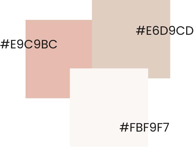
The color combination of “beige, soft pink, and off white” for the nail spa brand “Etel” creates a serene and feminine visual identity. Beige represents neutrality, sophistication, and a timeless appeal, reflecting the brand’s elegance and versatility. Soft pink adds a delicate and calming touch, evoking a sense of relaxation and femininity. Off white contributes to the overall softness and purity of the color palette, creating a clean and fresh ambiance. Together, these colors create a harmonious blend that conveys a sense of tranquility, refinement, and a pampering experience, aligning perfectly with the relaxing and rejuvenating atmosphere of a nail spa.
LET”S COLLABORATE