Lafat Samoli
We create an amazing logo and identity for a popular Kuwait street food.

We create an amazing logo and identity for a popular Kuwait street food.
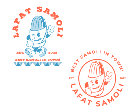
visually engaging and appetizing visual identity. The logo design incorporates an illustration of a mouthwatering sandwich, symbolizing the brand’s focus on delicious and authentic Samoli sandwiches. The character adds a playful and inviting touch to the logo, evoking a sense of enjoyment and satisfaction. The “Lafat Samoli” logo’s sandwich character represents the brand’s commitment to offering tasty and flavorful street food, capturing attention and enticing customers to try their delectable offerings. It creates a memorable and distinct logo that reflects the brand’s passion for serving up delightful Samoli street food in Kuwait.
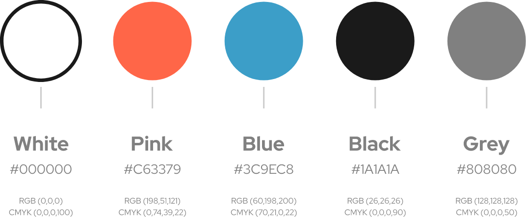
Pinkish orange represents energy, excitement, and a hint of sweetness, reflecting the brand’s delectable and flavorful street food offerings. Blue adds a touch of freshness, trust, and a sense of authenticity, symbolizing the brand’s commitment to using high-quality ingredients. Grey brings a sense of sophistication, balance, and a touch of urban appeal, capturing the essence of street food culture. Together, these pastel colors create a harmonious blend that conveys a sense of enjoyment, creativity, and a memorable culinary experience. The pastel color combination aligns perfectly with the “Lafat Samoli” brand’s dedication to serving up delicious and modern street food, enhancing its visual appeal and making it stand out in the bustling street food market.
LET”S COLLABORATE