Novel Scent
We create an amazing logo and identity for a premium incense brand.

We create an amazing logo and identity for a premium incense brand.

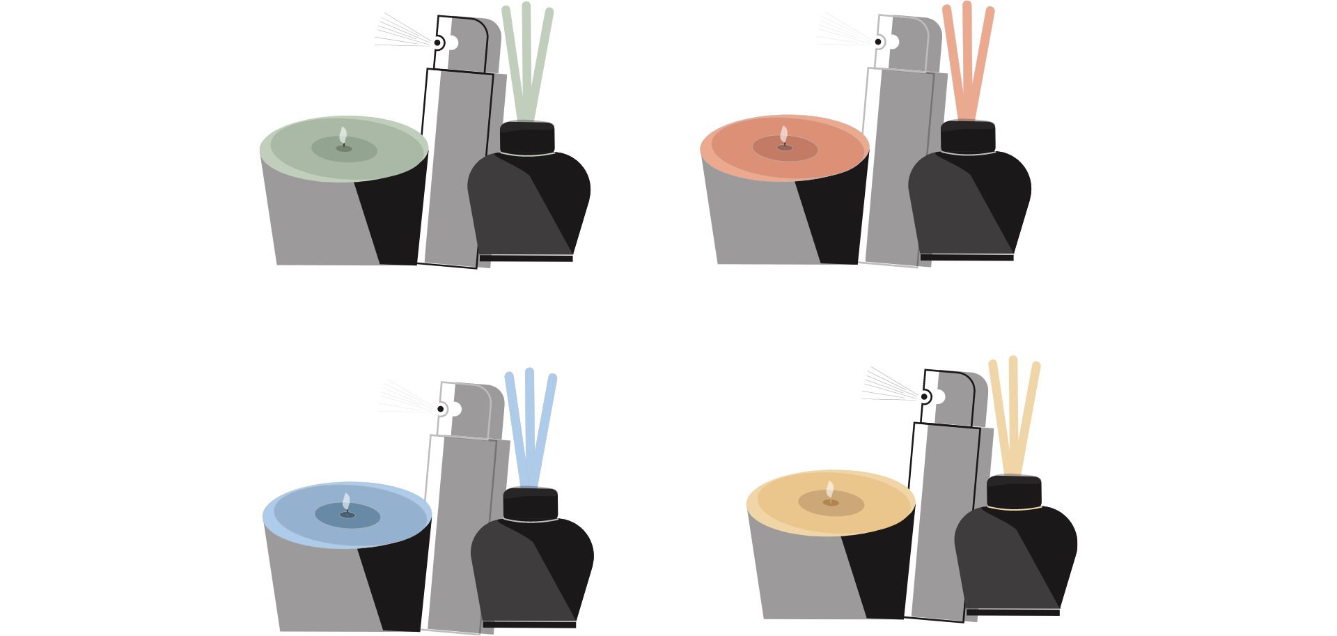
Illustration style that captures the essence of the product. The logo design features an intricate and captivating illustration of an incense stick or smoke, representing the brand’s focus on unique and alluring scents. The illustration style is carefully crafted to convey a sense of artistry, mystique, and elegance. It captures the attention of viewers and immerses them in the world of aromatic experiences. The “Novel Scent” logo’s illustration style embodies the brand’s commitment to providing exceptional and innovative fragrances, creating a visual representation of the captivating and enticing nature of their incense products.

Creates a vibrant and harmonious visual identity. Orange symbolizes energy, warmth, and creativity, reflecting the brand’s dynamic and captivating nature. Green represents freshness, growth, and harmony, evoking a sense of natural beauty and balance. Blue adds a touch of tranquility, serenity, and sophistication, conveying a sense of calmness and luxury. Yellow brings a sense of optimism, joy, and brightness, adding a lively and cheerful element to the color palette. Together, these pastel colors create a visually appealing blend that exudes an overall feeling of luxury, creativity, and a captivating sensory experience. The color combination aligns perfectly with the “Novel Scent” brand’s focus on offering unique and enchanting fragrances, enhancing its visual appeal and creating a memorable impression.
LET”S COLLABORATE