Nustel
We create an amazing logo and identity for a fashion brand.

We create an amazing logo and identity for a fashion brand.
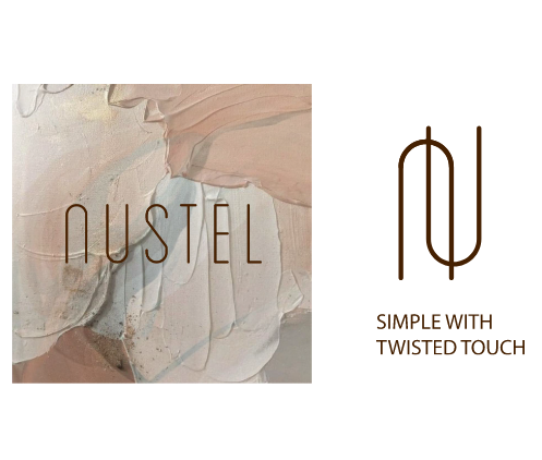
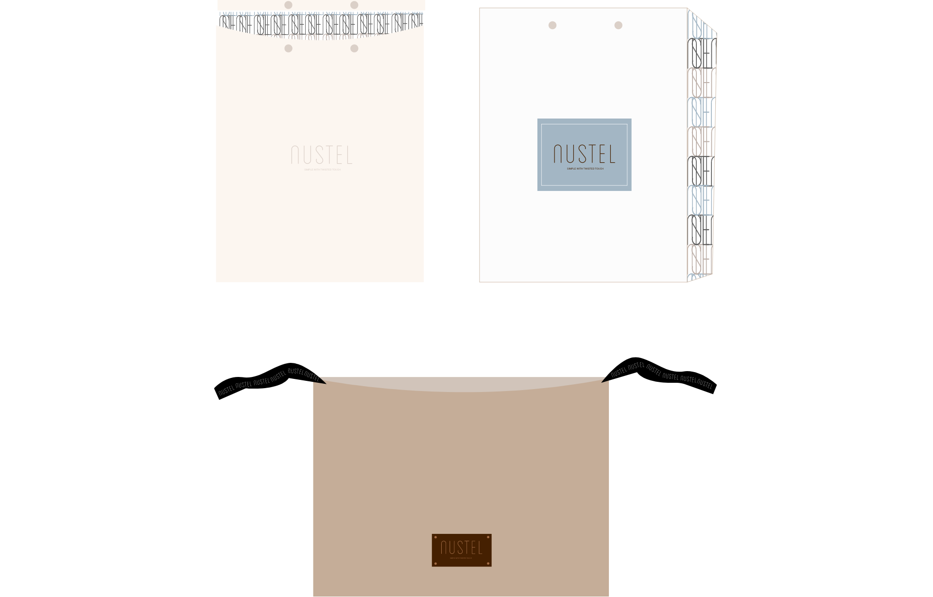
The “Nustel” logo design incorporates the letters “N” and “U” to represent the fashion brand. The letter “N” is skillfully integrated, creating a distinct shape that symbolizes elegance, movement, and style. It serves as a prominent element in the logo, showcasing the brand’s strong identity. The letter “U” complements the design by adding a sense of symmetry and balance. The combination of these letters forms a unique and visually appealing mark that embodies the essence of the fashion brand, conveying a message of sophistication and creativity.

Combination of “earth tones” for the fashion brand “Nustel” creates a natural and grounded visual identity. Earth tones typically include warm, muted colors inspired by nature, such as browns, beiges, and sky color. These colors evoke a sense of warmth, comfort, and harmony, aligning with the brand’s values of authenticity and a connection to the earth. The earth tone palette adds a touch of timeless elegance and versatility to the brand’s aesthetic, appealing to a wide range of consumers and providing a sense of understated luxury.
LET”S COLLABORATE