Ortus
We create an amazing logo and identity for a elegant salon brand.

We create an amazing logo and identity for a elegant salon brand.
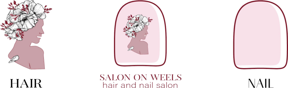
Empowering visual identity. The logo design incorporates an illustration of a confident and stylish woman, symbolizing the brand’s focus on beauty and self-expression. The woman character adds a touch of elegance and sophistication to the logo, evoking a sense of empowerment and confidence. The “Ortus” logo’s woman character concept represents the brand’s dedication to providing top-notch salon services that help customers look and feel their best. It creates a memorable and distinct logo that reflects the brand’s passion for empowering women through beauty and self-care, evoking a sense of grace and beauty.
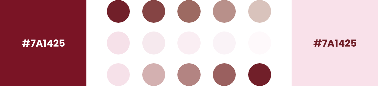
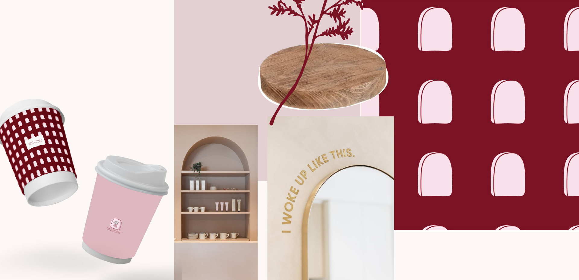
The color combination of “red and pink” for the salon brand “Ortus” creates a bold and feminine visual identity. Red represents passion, energy, and confidence, reflecting the brand’s commitment to helping customers feel empowered and beautiful. Pink adds a touch of sweetness, romance, and a sense of care, enhancing the overall ambiance of the salon. Together, these colors create a harmonious blend that conveys a sense of elegance, empowerment, and a memorable salon experience. The “red and pink” color combination aligns perfectly with the “Ortus” brand’s focus on providing top-notch beauty services and creating a welcoming and delightful salon environment.
LET”S COLLABORATE