Peaco
We create an amazing logo and identity for a chocolate brand.

We create an amazing logo and identity for a chocolate brand.

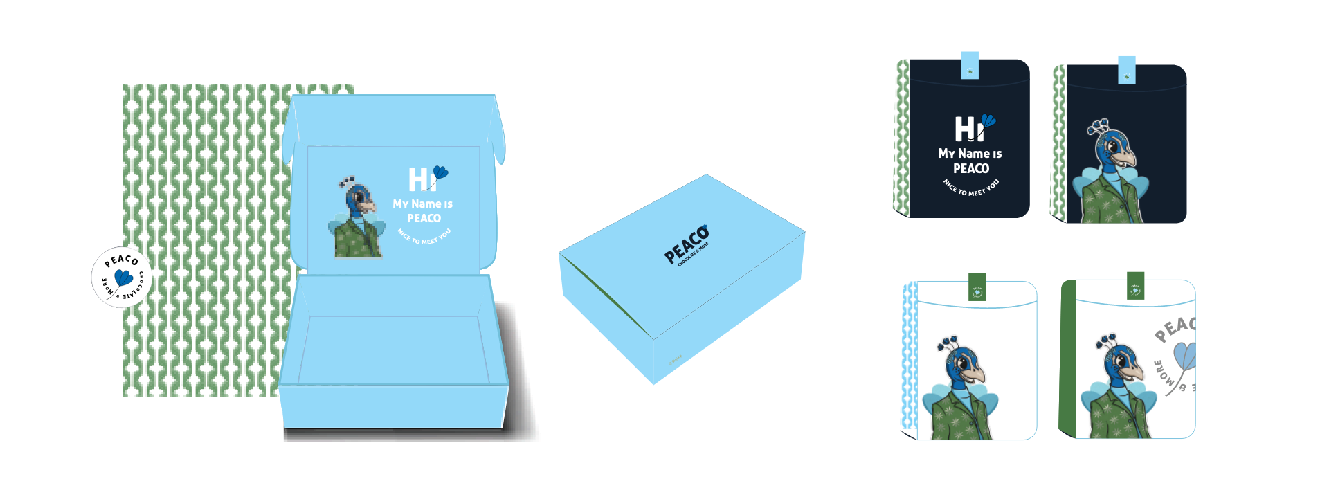
The “Peaco” logo for the chocolate brand features a Peacock character, creating a visually stunning and exotic visual identity. The logo design incorporates an illustration of a majestic Peacock, symbolizing the brand’s focus on offering exquisite and luxurious chocolates. The Peacock character adds a touch of elegance and splendor to the logo, evoking a sense of opulence and indulgence. The “Peaco” logo’s Peacock character represents the brand’s commitment to providing unique and delightful chocolate creations, capturing attention and enticing customers to savor their delectable treats. It creates a memorable and distinct logo that reflects the brand’s passion for crafting exceptional chocolate products, evoking a sense of beauty and sophistication.

Navy represents elegance, depth, and a touch of luxury, reflecting the brand’s commitment to offering premium and exquisite chocolates. Blue adds a sense of trust, reliability, and a hint of serenity, symbolizing the brand’s dedication to using high-quality ingredients. Green brings a touch of natural beauty, freshness, and a sense of indulgence, capturing the essence of the chocolate’s rich flavors. Light blue adds a delicate and calming touch, evoking a sense of delight and sweetness. Together, these colors create a balanced blend that conveys a sense of beauty, opulence, and a memorable chocolate experience. The color combination aligns perfectly with the “Peaco” brand’s focus on crafting exceptional and visually appealing chocolates, enhancing its visual appeal and making it stand out in the chocolate market.
LET”S COLLABORATE