Quatro
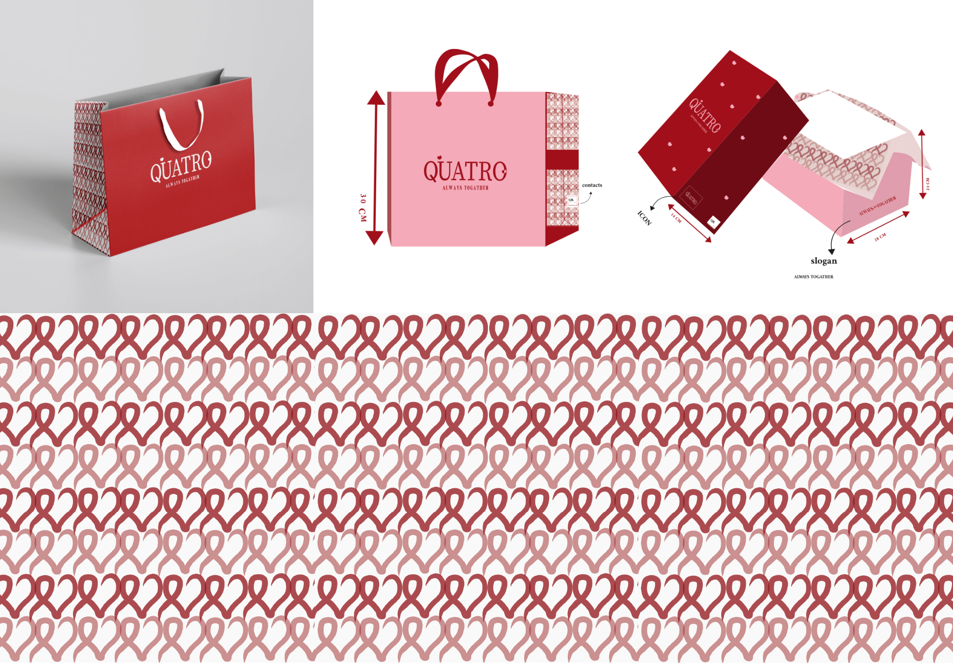
Luxury fashion brand identity

Luxury fashion brand identity
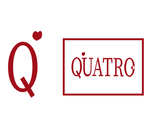
Love shape, typically in the form of a heart, conveys emotions such as love, passion, and romance. It adds a touch of sentimentality and playfulness to the brand’s visual identity. The logo design utilizes the love shape in a creative and unique way, possibly by integrating it within the typography or as a standalone element. This combination evokes a sense of love for fashion, creating a strong emotional connection with the target audience and highlighting the brand’s commitment to creating garments that inspire love and confidence.
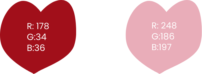
Red symbolizes passion, energy, and power, reflecting the brand’s dynamic and confident nature. Pink adds a touch of femininity, romance, and playfulness, appealing to the brand’s target audience. The combination of these colors creates a striking contrast and a sense of harmonious balance. It conveys a message of self-expression, daring fashion choices, and a celebration of individuality. Overall, the red and pink color palette adds an exciting and eye-catching element to the brand’s aesthetic, leaving a lasting impression on customers.
LET”S COLLABORATE