Recipes by G
We create personal logo with unique touch for Bakery brand

We create personal logo with unique touch for Bakery brand

The rolling pin illustration symbolizes the brand’s commitment to baking and craftsmanship, evoking a sense of tradition and attention to detail. The letter “G” in the logo’s lettering style is uniquely designed to reflect the brand’s identity, adding a personalized and memorable touch. The combination of the rolling pin illustration and the distinct “G” lettering creates a visually appealing and cohesive logo that represents the brand’s dedication to creating delicious and artisanal baked goods. It captures the essence of the bakery’s recipes and expertise, appealing to customers and conveying a sense of quality and authenticity.
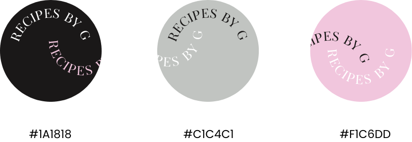
The color combination of black and pink for the bakery brand “Recipe by G” creates a bold and playful visual identity. Black represents sophistication, elegance, and a sense of tradition, reflecting the brand’s commitment to quality and craftsmanship in its recipes. Pink adds a touch of femininity, sweetness, and charm, appealing to the bakery’s target audience and conveying a sense of joy and delight. Together, the black and pink color combination creates a striking contrast that captures attention and creates a visually appealing brand image. This color combination aligns with the brand’s goal of offering delectable and visually enticing baked goods, creating a memorable and enticing experience for customers.
LET”S COLLABORATE