Bezmoda
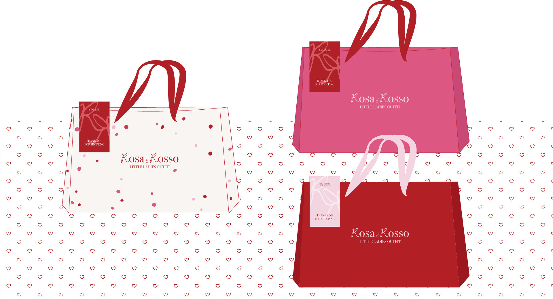
We create an amazing logo and identity for a baby girl outfit brand.

We create an amazing logo and identity for a baby girl outfit brand.
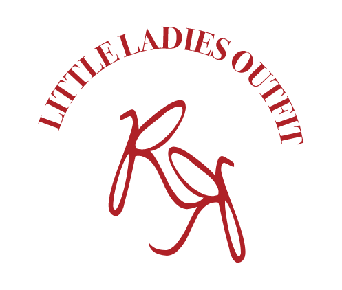
Charming and feminine visual identity. The logo design utilizes a playful and elegant lettering style, carefully chosen to reflect the brand’s focus on adorable and fashionable baby girl clothing. The lettering concept adds a touch of sweetness and personality to the logo, evoking a sense of joy and delight. The “Rosa & Rosso” logo’s lettering concept represents the brand’s dedication to providing stylish and comfortable outfits for baby girls, capturing attention and appealing to parents who seek the perfect clothing for their little ones. It creates a memorable and endearing logo that reflects the brand’s passion for dressing baby girls in lovely and trendy outfits, evoking a sense of warmth and love.
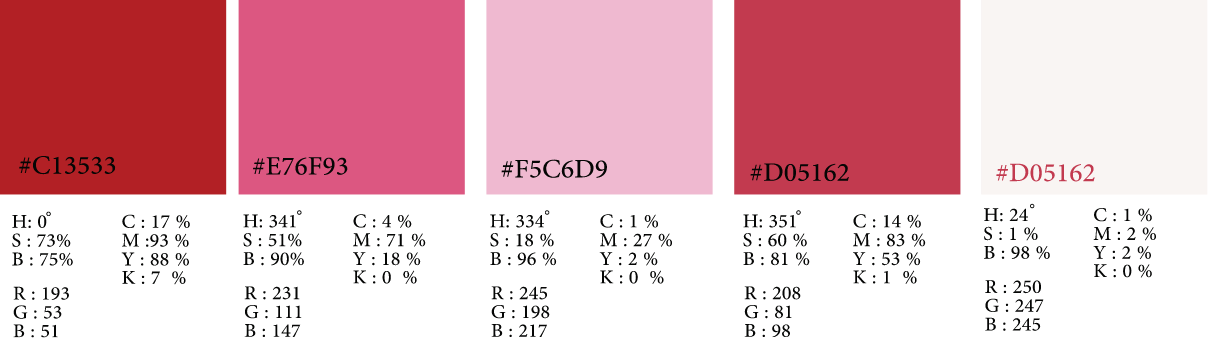
Vibrant and feminine visual identity. Dark red adds a sense of elegance and sophistication, reflecting the brand’s commitment to offering high-quality and stylish outfits. Pink adds a touch of sweetness and charm, evoking a sense of innocence and joy, perfect for baby girls. Magenta brings a bold and modern element to the color palette, adding a hint of playfulness and creativity. Together, these colors create a harmonious blend that conveys a sense of vibrancy, fashion-forwardness, and a delightful clothing experience for baby girls. The color combination aligns perfectly with the “Rosa & Rosso” brand’s focus on providing adorable and fashionable outfits, enhancing its visual appeal and making it stand out in the baby fashion industry.
LET”S COLLABORATE