Sweet Talk
We create an amazing logo and identity for a sweet cake brand.

We create an amazing logo and identity for a sweet cake brand.
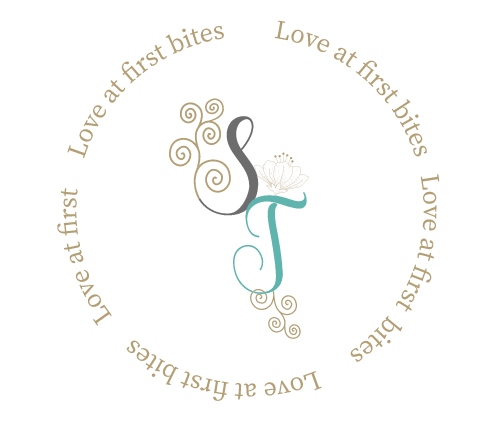
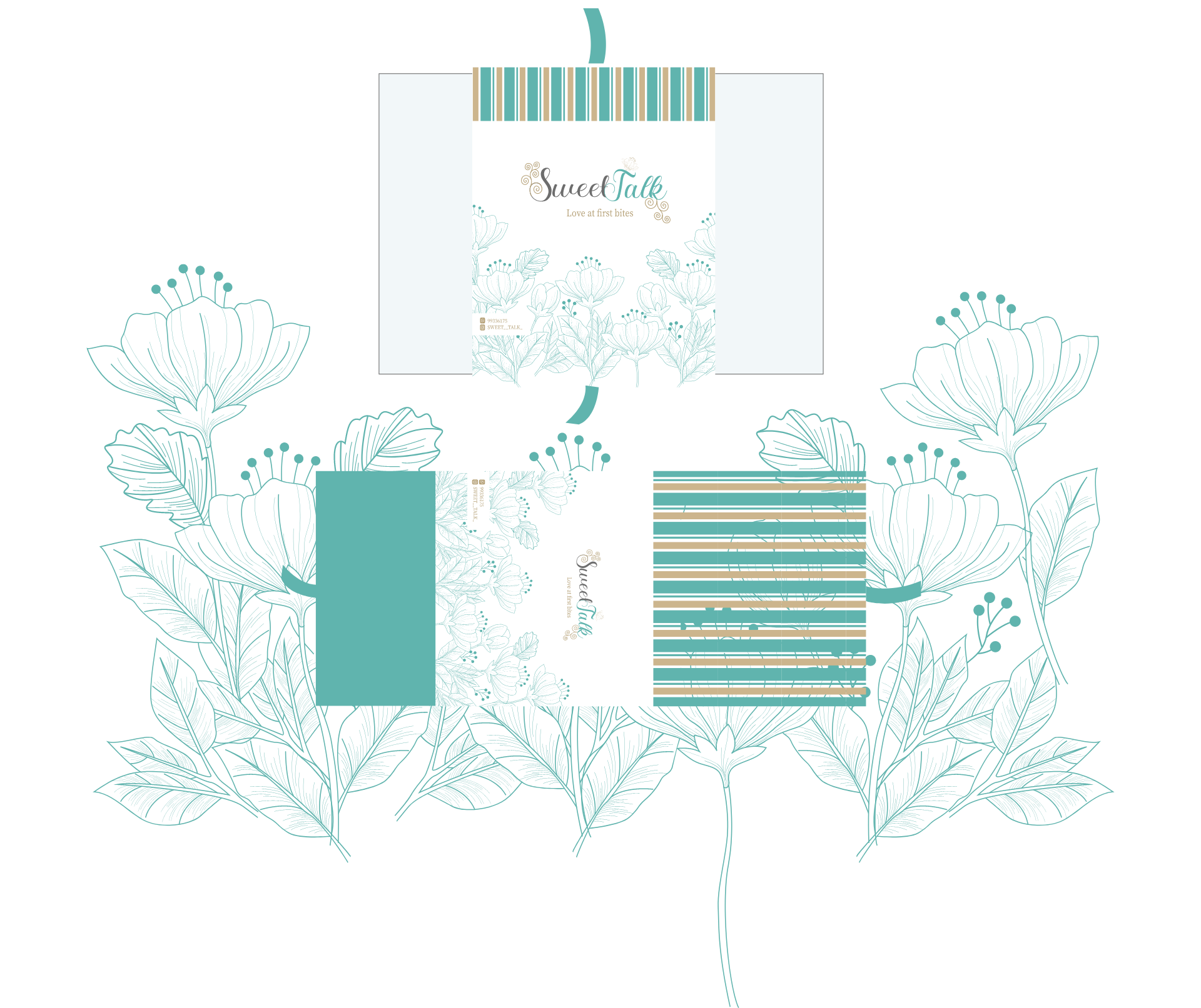
Playful and inviting visual identity. The logo design utilizes a unique and expressive lettering style, carefully chosen to reflect the brand’s focus on sweet treats and desserts. The lettering word mark captures attention and evokes a sense of joy, adding a touch of whimsy and charm to the logo. The “Sweet Talk” logo’s lettering word mark communicates a sense of indulgence, highlighting the brand’s commitment to creating delectable and mouth-watering cakes. It represents a fun and enticing approach that resonates with customers and sets the brand apart in the competitive sweet cake industry.
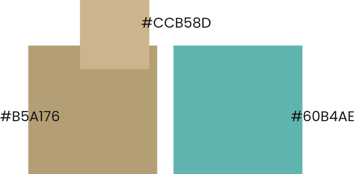
“Sweet Talk” creates a soft and delightful visual identity. Light blue represents tranquility, freshness, and a sense of calmness, reflecting the brand’s soothing and enjoyable sweet offerings. Beige adds a touch of warmth, elegance, and neutrality, enhancing the overall aesthetic of the brand. Together, these pastel colors create a harmonious blend that conveys a sense of sweetness, comfort, and a pleasant experience. The pastel color combination aligns perfectly with the “Sweet Talk” brand’s focus on creating delectable and delightful treats, enhancing its visual appeal and capturing the attention of customers with its gentle and inviting color palette.
LET”S COLLABORATE