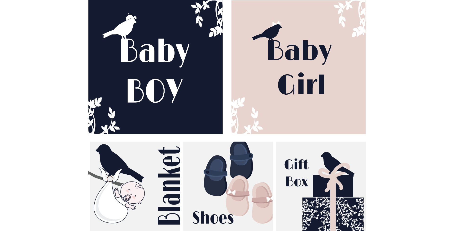
The B
We create an amazing logo and identity for a baby boutique.

We create an amazing logo and identity for a baby boutique.
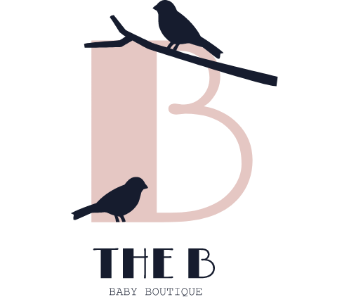
The bird symbolizes freedom, innocence, and a sense of lightness. It adds a playful and whimsical touch to the brand’s visual identity. The logo design creatively combines the bird element with the letter “B” in a way that is unique and recognizable. This combination captures the essence of the baby boutique, evoking a sense of joy, curiosity, and imagination. The bird element serves as a charming symbol that resonates with parents and conveys the brand’s focus on providing delightful and enchanting products for babies and young children.
LET”S COLLABORATE